
Get CB in your inbox


Get the print edition
Published four times a year, delivered straight to your door. Access best-in-class journalism about the innovation economy and the inspiring individuals leading the charge in the newly redesigned CB magazine.
People

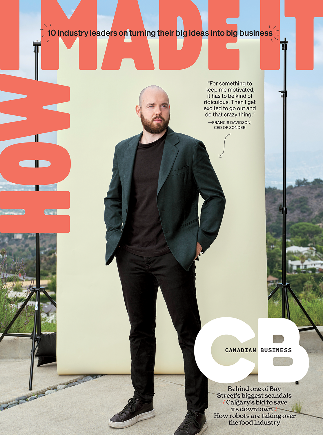
How I Made It


How I Made It

Strategies


Ideas


Ask A Recruiter